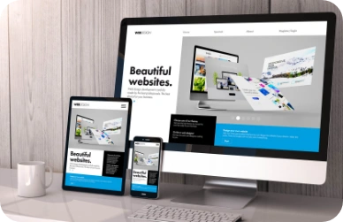
Build Mobile Experiences
That Drive Results
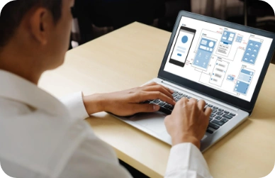
In today’s mobile-driven ecosystem, businesses need fast and user-centric digital products. Our mobile-first design solutions help brands build mobile experiences that improve user engagement and accelerate business growth across platforms.
Connect with Our TeamLeading the Future with Our Mobile-First Design Solutions
We create engaging mobile-first digital experiences that deliver smooth performance across devices and platforms, helping businesses maximize user engagement, enhance brand visibility, and drive long-term digital growth.
We create intuitive engaging mobile-first application designs focused on seamless navigation, responsive layouts, and enhanced user experiences across smartphones, tablets, and modern digital devices.
Our team develops scalable and high-performing mobile applications optimized for speed, usability, and cross-platform functionality while ensuring smooth performance across multiple systems.
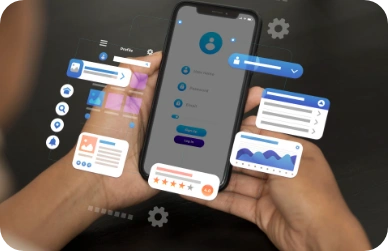
We Design User-Centric Interfaces That Combine Creativity With Functionality To Deliver Meaningful Digital Experiences, Improve User Engagement, And Simplify Customer Journeys.

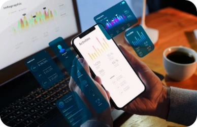
Our Mobile-First Solutions Are Optimized For Faster Loading Times, Smooth Interactions, And Improved Responsiveness To Enhance User Retention And Overall Application Performance.
We build feature-rich web applications and Progressive Web Apps (PWAs) that offer native app-like experiences, offline accessibility, and seamless performance across devices.
We create responsive digital experiences that automatically adapt to different screen sizes, ensuring consistency, usability, and visual appeal across mobile, tablet, and desktop platforms.
Our AMP solutions help businesses improve mobile page speed, enhance search visibility, and deliver lightning-fast browsing experiences for users across mobile devices.
Empowering Brands with Mobile-First Digital Experiences
We help businesses create fast, intuitive, and engaging mobile-first solutions that enhance user experiences, improve accessibility, and drive sustainable digital growth across every device and platform.
Transforming Industries with Mobile-First Innovation
We develop scalable and user-focused mobile solutions tailored to industry-specific needs, helping businesses enhance customer experiences, streamline operations, and accelerate digital growth across competitive markets.


Our Work that Speaks
Transforming ideas into next-gen digital
experiences that redefine technology.
Woodland
Turning an underused app into a mobile-first digital experience that drives loyalty and engagement.
42%
Boost In App To Purchase
Conversions
30%
Increase In
Repeat Purchases

Flowmode
Building a dynamic website for both India and the UK. We use high-energy visuals and video for social media presence, along with strong SEO.
32%
Increase in Sales from Website
25%
Social Media Followers

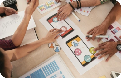
Our Mobile Design Toolkit
From research and prototyping to scalable UI systems, we design mobile experiences built for today's users.


Why Businesses Trust Our Mobile-First Design Expertise
We create user-focused mobile experiences that combine intuitive design, seamless functionality, and scalable solutions to help businesses engage users, strengthen brand presence, and achieve long-term digital success.

User-Centered Design Approach
Every mobile experience we create is built around real user needs and behaviors. Through research, journey mapping, and usability insights, we design intuitive interfaces that enhance engagement, simplify interactions, and improve customer satisfaction.

Scalable & Future-Ready Solutions
Our mobile-first designs are crafted with growth in mind. We develop flexible design systems and adaptable interfaces that support new features, evolving technologies, and expanding user bases without compromising consistency or performance.

Brand-Focused Visual Experiences
We transform your brand identity into compelling mobile experiences that capture attention and build trust. From typography and color systems to interactive elements, every detail is designed to create a memorable and recognizable digital presence.

Fast, Responsive & Optimized Interfaces
Performance is at the core of every design decision. We create lightweight, responsive mobile experiences that load quickly, adapt seamlessly across devices, and deliver smooth interactions that keep users engaged wherever they are.
Your Next Door Global Technology Partner
Recognized with the Pioneer Leadership Excellence Award 2025 by The Economic Times. This recognition reflects our strong commitment to innovation, technology excellence, and delivering high-performance digital solutions for businesses across global markets.

FAQ
Got Questions? We've Got Answers
We know choosing the right technology partner is an important decision. That’s why we’ve answered the most common questions about our process, industry expertise, and collaboration approach. It helps you understand how we deliver impactful digital solutions.
Mobile-first design is an approach where the user experience is designed for mobile devices first and then adapted for larger screens. This ensures optimal usability, performance, and responsiveness across all devices.
With most users accessing websites and applications through smartphones, mobile-first design improves user engagement, accessibility, search visibility, and conversion rates while delivering a seamless experience.
Yes. We create mobile-first designs tailored for both iOS and Android platforms, ensuring platform-specific best practices while maintaining a consistent brand experience.
We conduct user research, create intuitive navigation structures, develop interactive prototypes, and perform usability testing to ensure the final design meets user expectations.
Absolutely. We can evaluate your current mobile app, identify usability challenges, modernize the interface, improve user journeys, and optimize overall user experience.
Yes. Our responsive and adaptive design approach ensures your application delivers a consistent experience across smartphones, tablets, and various device resolutions.
Project timelines depend on complexity, features, and requirements. Most mobile design projects typically range from a few weeks to several months.
Yes. We create interactive prototypes and wireframes that allow stakeholders to review, test, and validate the user experience before the development phase starts.
Transform Your Mobile Experience Into a Competitive Advantage
From user research and intuitive interfaces to responsive mobile experiences, we design solutions that help businesses
engage users, strengthen brand loyalty, and drive measurable growth across every touchpoint.
Contact Us
Schedule The Appointment At Your Convenience Date And Time.
30 Min
Web Conference
Time Zone
Indian standard time (08:30pm)

Thanks For Getting In Touch!
You’ve Taken The First Step Toward Transforming Your Digital Presence. Our Experts Will Reach Out Shortly To Take It Forward.
Launch Your Dream Project
Provide a brief overview of your project, and our specialists will evaluate your requirements. We will connect with you to explore how the right digital solutions can help you launch faster.